Orientation

Label types for product, packaging and process

A label can make a brand visible, organise information, bridge a closure or allow packaging to be opened and closed again several times. Which label type suits that task is not decided by shape and size alone. The position on the product, the intended function, the surface of the container and the later processing matter just as much.

This page gives an overview of the most important label types. It ranges from the classic front and back label through lid labels and sleeves to functional solutions such as seal, multi-layer or resealable labels.

123456
  • Bottle, front view
  • Canister, back view
  • Tin with lid
  1. 1Front label
  2. 2Back label
  3. 3Lid label
  4. 4Seal strip
  5. 5Neck label
  6. 6Sleeve
Six typical positions on three containers. Several of them can be combined on one product.

Selection guide

Which label type suits my product?

The simplest orientation comes from the job the label has to do.

Several label types can be combined on one product. A jar may carry a front label for brand impact, a back label for product information, a lid label to identify the variety and a seal strip across the joint. What matters is that the individual surfaces work together and the container does not look restless or overloaded.

Where does it sit?

Label types by position on the product

The position determines which job a surface can take on and what to watch for in design and processing.

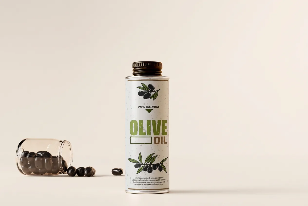
Olive oil tin, the front label carries the product name and an olive branch

Front labels: the display side of the product

The front label is the most visible surface on the product. The terms main label and display label are also common. It brings together brand, product name and variety and makes sure the product is recognised quickly and placed correctly within a product line.

A good front label does not have to carry as much content as possible. Its strength lies in a clear visual hierarchy. What is the brand? Which product is this? Which variant is in front of the viewer? On bottles, jars, cans and cosmetic containers in particular, the interplay of format, contour, material and print effect shapes the entire appearance.

The shape of the container and the actual display side matter for planning as well. On curved or conical containers a format can look convincing that still feels unfamiliar in a flat layout view. Checking early on the original product helps to judge proportions and placement realistically.

Suitable for: Food, beverages, wine and spirits, cosmetics, household products and technical products.
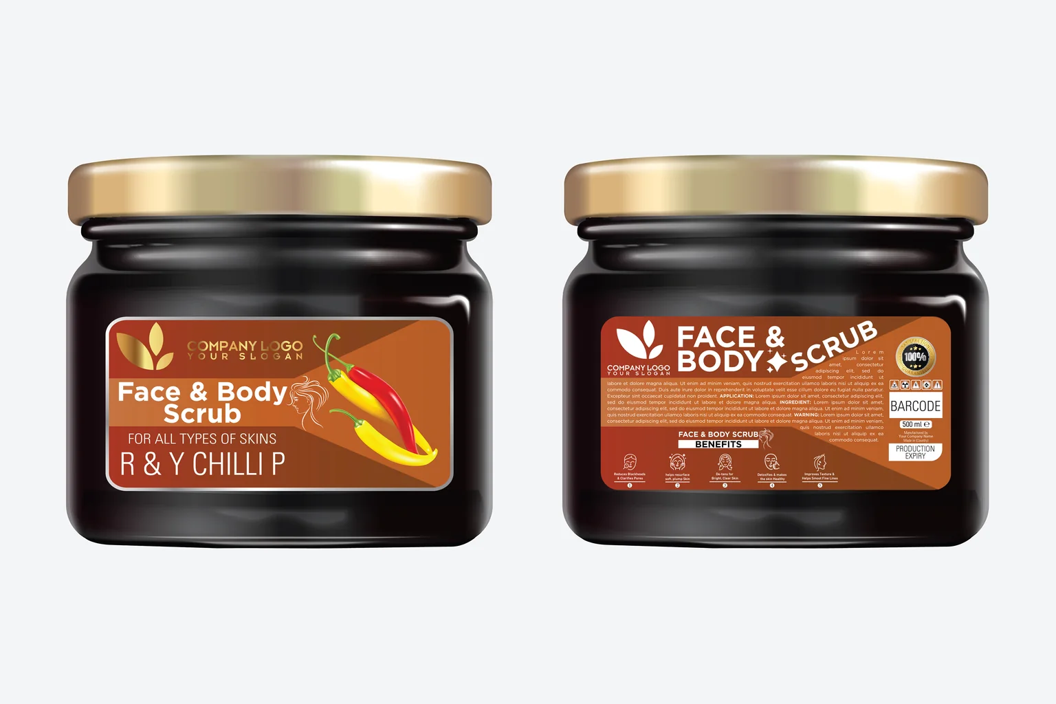
Two matching scrub jars: on the left the front label with brand and variant, on the right the back label with directions, benefits and a barcode field

Back labels: room for orientation and product detail

The back label adds the information that matters for selection, use and unambiguous identification. This can include the product description, ingredient or usage notes, manufacturer details, a barcode, a QR code or further product-specific content.

For customers a back label works well when information stays easy to find. A clear structure, sufficient contrast and a sensible separation of text, symbols and codes usually help more than filling the surface as densely as possible. The position of the barcode or a machine-readable code should also suit the shape of the container and the intended scanning process.

Front and back label can be developed as a design pair. Recurring colours, typography and shapes connect the two sides while each surface keeps its own job. Where varieties or language versions change frequently, a clearly structured data and version logic can additionally support recognition within the series.

Suitable for: Products with additional information requirements or a clearly separated display and information side.

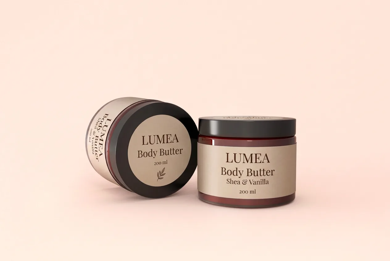
Two cosmetic jars, a round lid label with brand and content sits on the lid of the tilted jar

Lid labels: extra attention from above

A lid label uses the top of a lid as a communication surface in its own right. It can repeat the brand, identify a variety, highlight a short message or visually connect the design of container and closure.

This label type is particularly interesting where products are viewed from above, for instance in trays, displays, chilled cabinets or opened shipping cartons. On cans, jars and pots the lid often offers a free surface that clearly differs from the front label.

The real viewing distance is what counts in the design. A clear motif or a short message is usually more effective on a small lid than densely compressed text. Technically, lid material, embossing, grooves, curvature and the movement when opening have to be taken into account.

Suitable for: Cans, jars, cups, pots and other containers with enough usable lid surface.

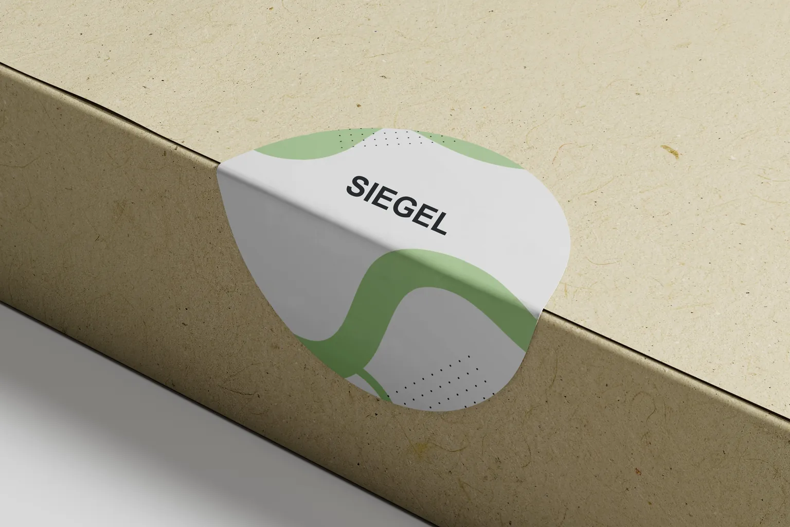
Seal label bridging the joint of a carton

Closure and seal labels: connecting across the joint

A closure label connects two areas of a pack, for example lid and jar, screw cap and bottle, or flap and box. It can hold packaging closed, mark the opening area or be designed as a visible bridge across the joint.

Where the first opening has to be recognisable, simply covering the joint is not always enough. The construction has to create a visible change, for instance through a strip that tears in a defined way, a perforation or a security material intended for this purpose. Which solution fits depends on the opening movement, container geometry, bonding surfaces and the intended statement.

Seal labels can also be part of the packaging design. Colour, shape and print carry the design from the container onto the closure. An opening instruction can be integrated directly into the seal strip without the label looking like an element added afterwards.

For a reliable choice, lid and container should be considered separately. They can be made of different materials, be textured to different degrees and transfer different forces onto the label when opened.

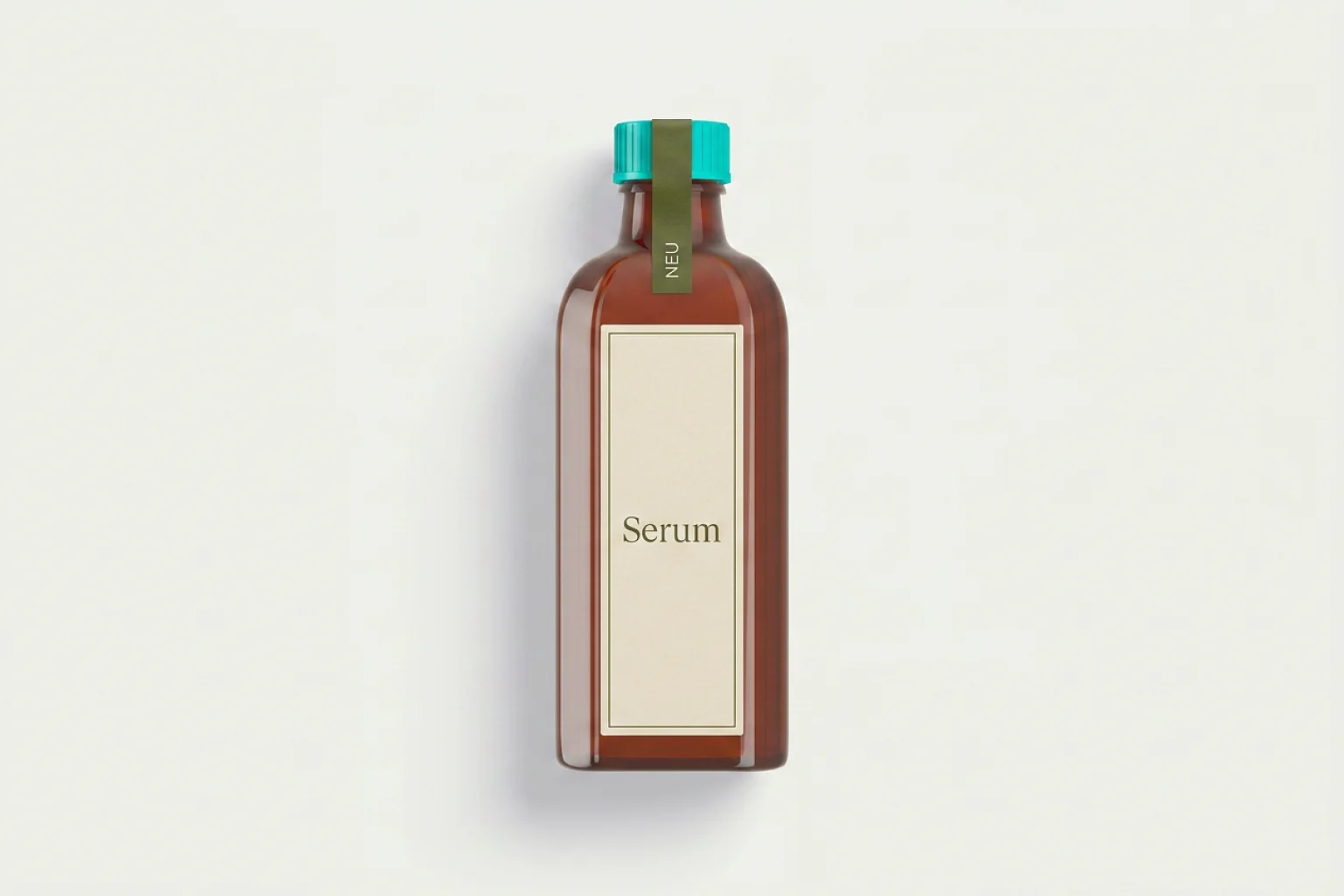
Bottle neck with a wrap-around neck band

Neck labels and neck rings: attention at the bottle neck

The neck of a bottle offers an additional surface without replacing the front or back label. Depending on the construction, different label types are used here.

  • Neck labels are applied directly to the bottle neck. They can emphasise the transition between body and closure or carry an additional marking.
  • Neck rings enclose the neck fully or partly. Their distinct shape stands out and they can carry a short message, a variety colour or promotional information.
  • Bottle tags and neck hangers hang from the neck and are not automatically self-adhesive. They offer additional communication space, can be removed and therefore suit promotions, serving suggestions or supplementary product information.

These terms are not always used consistently in the market. For project planning it is therefore more important how the element is to be attached to the product: permanently bonded, executed as a closed ring, or simply hooked on.

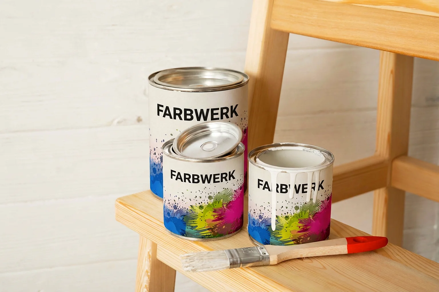
Three paint tins, the sleeve running once around each can

Sleeves and wrap-around labels: once around the product

A sleeve runs once around the product. This creates a continuous surface across the entire circumference, considerably more than a single front label offers. The pack looks consistent from every viewing angle, and brand, product description and supplementary content can be combined in one continuous design.

Because the label covers the full circumference, there is no design back side in the classic sense. The transition becomes the topic: start and end meet, and that is where it is decided whether the print runs on cleanly. Motif, text flow and the later orientation on the container should therefore be planned across the full circumference from the start.

On cylindrical containers, circumference and overlap are the decisive dimensions. On conical or profiled shapes the contour has to be developed so that the print looks right on the product and the material lies flat.

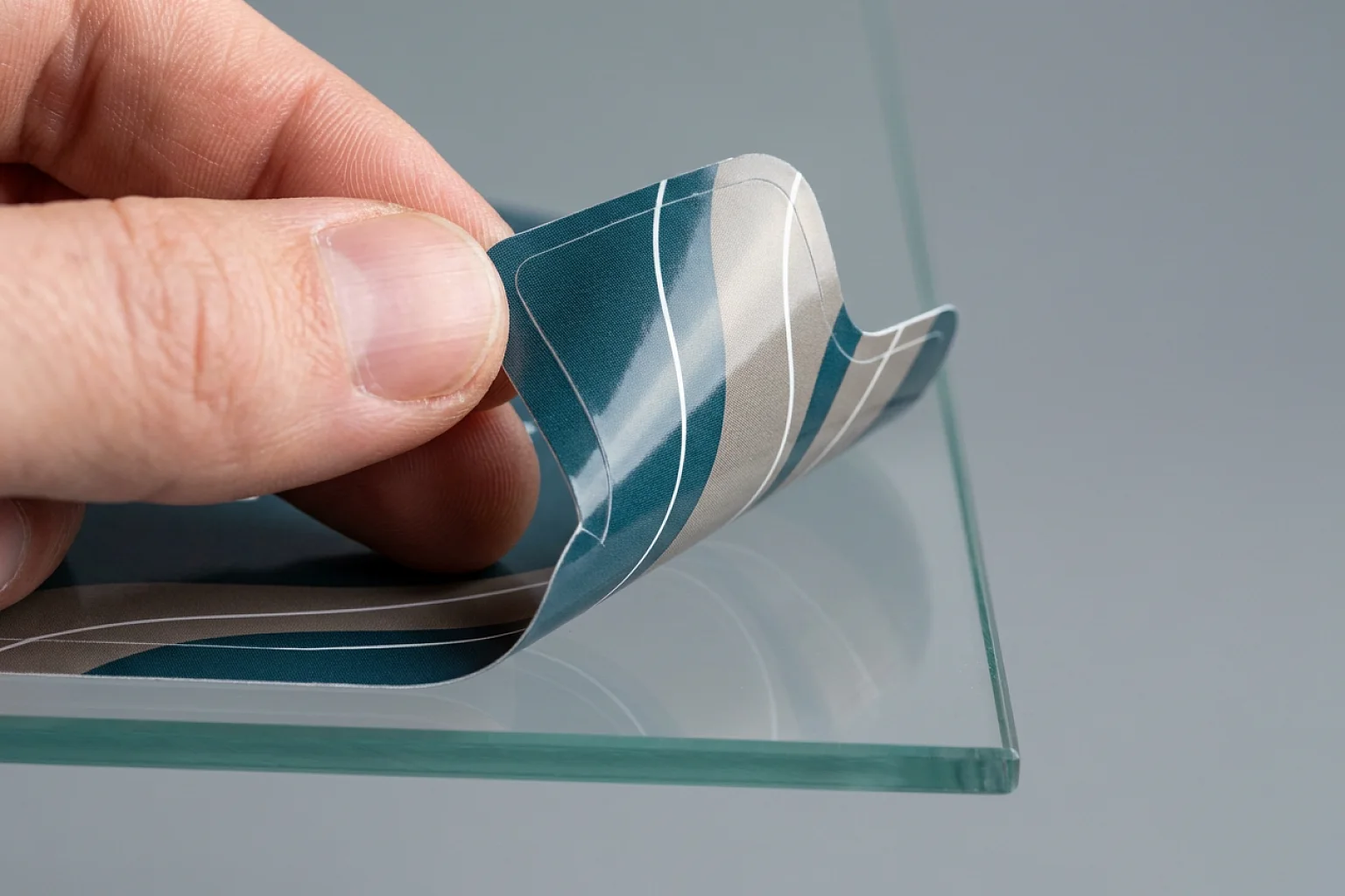
Label with a curved custom contour being peeled off a glass surface

Custom-shape labels: when the contour becomes part of the design

Labels do not have to be rectangular, round or oval. An individual contour can take up a motif, create a characteristic silhouette or deliberately leave room for viewing windows, closures and other components.

The shape should do more than decorate. It can make alignment on the product easier, keep a grip area clear or make a product line unmistakable. Very fine points, tight inner radii and narrow webs do have to suit the intended processing. What can be shown as delicate on screen still has to be die-cut cleanly, released from the liner and applied to the product afterwards.

For custom shapes, a dimensioned drawing, a container sample or reliable contour data are particularly helpful. That allows an early check of whether design, material and labelling process fit together.

What does it do?

Label types with an additional function

Position on the product is only one way of distinguishing labels. Many solutions are defined above all by their function. A functional label can be a front, back or lid label at the same time.

Multi-layer labels

A lot of content on a small footprint

Multi-layer labels consist of several printable levels that are opened or leafed through. They create additional surface where there is little room on the container or where information has to be organised across several languages and steps of use. A comprehensible opening direction, a tab that is easy to grip and a construction that suits the shape of the product are what matter.

Resealable labels

Open, take out, close again

Resealable labels are intended for packaging that is opened and closed several times during use. A tab that can be gripped, the shape of the opening and the interplay of packaging film, adhesive and contents determine how the solution feels in everyday use. A reseal is not automatically tamper evidence. Where both functions are needed, they have to be combined by design.

Coupon labels

Information with a detachable extra

Coupon labels combine product marking with a peelable or detachable element. It can carry a promotional code, participation information or an additional note. What matters is that base label and coupon each still fulfil their intended job after removal.

Removable and wash-off labels

Think removal through

Removable labels are designed for applications where the label is to be taken off deliberately at a later point. Wash-off solutions additionally take an intended washing or cleaning process into account. Whether and how a label comes off always depends on the complete construction and the specific substrate.

No-label look

As little visible label edge as possible

With the no-label look the printed design should appear to sit directly on the product. Transparent materials and a carefully matched print bring motif and packaging to the fore. The effect depends largely on the surface, colour and transparency of the container as well as on the intended opacity of the print.

Variable data, thermal printing and RFID

Not a position, but a technology

Variable numbers, barcodes and QR codes do not describe a position on the product. They extend a label with changing data. The same applies to thermal labels intended for later printing and to RFID labels that integrate an electronic data carrier. Linerless in turn describes a labelling system without a conventional liner. Depending on the application, these technologies can be combined with different label types.

Material and adhesive

Material and adhesive follow the application

Paper or film? Permanent, removable or repositionable? The right answer follows from the product and its journey through filling, transport, storage, sale and use.

These questions matter most for the selection:

  • Which material is being labelled, for example glass, plastic, metal, cardboard or film?
  • Is the surface smooth, rough, varnished, coated, curved or heavily textured?
  • Is the label applied at room temperature, on a chilled container or under other conditions?
  • Will moisture, condensation, abrasion, grease, cleaning agents, cold or heat act on the label later?
  • Should it adhere permanently, be easy to remove, tear visibly on opening or close again repeatedly?
  • Which visual effect is intended, for instance natural, high-gloss, transparent, opaque or particularly robust?

The more precisely these conditions are described, the more specifically material, adhesive, print and surface protection can be matched to each other. An original container or a comparable sample is often more informative than the material designation alone.

Processing

Labels for manual or automatic application

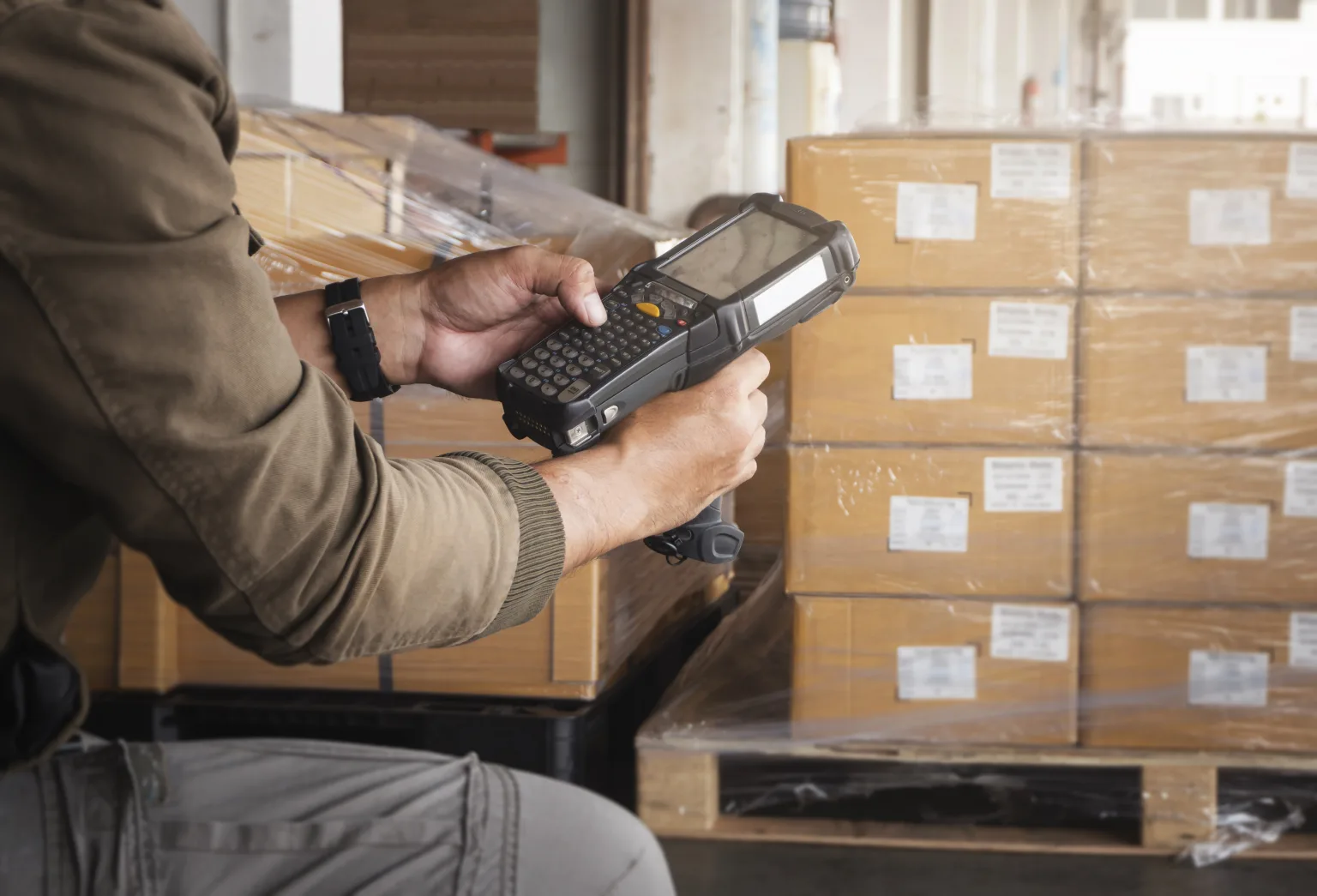
Warehouse worker scanning the labels on a palletised shipment with a handheld reader

Even the best design has to suit the later labelling process. Where the label is applied by hand, a clearly recognisable position and uncomplicated handling count. In automatic processing, format, gap on the roll, running direction, winding and the position of the print play an additional role.

With asymmetric shapes, long seal strips, sleeves and multi-layer constructions in particular, processing should be taken into account early. That produces not just a suitable label but a solution that fits into the intended workflow.

For a first assessment, details of the existing labelling equipment, the intended position on the product and the planned quantity help. Where roll specifications or technical drawings already exist, they can feed directly into the project clarification.

How to proceed

Five steps to the right label type

  1. 01

    Define the job

    Should the label present, inform, close, open, close again or make something traceable?

  2. 02

    Set the position

    Which surface does the customer see first, and which areas have to stay clear for use or processing?

  3. 03

    Describe the container

    Record shape, dimensions, material and surfaces of product and closure.

  4. 04

    Consider the environment

    Name labelling, storage and usage conditions as well as possible stresses.

  5. 05

    Clarify processing

    State manual or automatic labelling, delivery format, quantity and, where applicable, variable data.

You do not have to know the technical solution already. A photo, a sample container and a short description of the intended function are often enough to narrow down the suitable options.

Request a label project

Next step

The right label starts with the right question

Front label or sleeve, lid label or seal strip, classic single solution or functional multi-layer construction: the best label type is the one that fulfils a specific job on the product reliably and comprehensibly.

Show us your product and describe briefly what the label has to achieve. Together we will narrow down the suitable label type and develop a workable solution from it.

Quality you can verify

Our certifications & partnerships

  • EcoVadisSilver rating · Top 15% (September 2026)
  • ClimatePartnerClimate contribution available per order
  • ISO 9001Quality management
  • ISO 14001:2015Environmental management (QAS International) · Certificate no. GMEN1114
  • VskE memberlabels association
  • FSC® C006747Responsible forestry
  • EN 16247-1Energy audit

Contact

Your contact team

Let's solve your labeling challenges together.

Contact form

We will get back to you within one business day.